a typeface
inspired by wim crouwel
a little background.
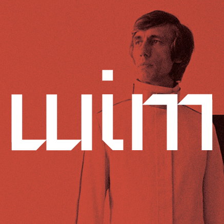
during college, i became a little... obsessed with a dutch designer named wim crouwel. his work "the new alphabet" was an experiment into deconstructed letterforms; designed to push the boundaries of (what was then considered new) crt computer monitor technology.
the letterforms were composed solely of vertical and horizontal lines, and was borderline illegible. very avant-garde. fun stuff. i set out to redesign the new alphabet to be make things legible and usable in the modern era.
during my experiments, i found that the face worked exceedingly well as body copy in addition to headlines!
this case study is typeset entirely in wim. rad.
the new
alphabet was
over-the-top,
and really
never meant
to be used.
it was
unreadable.
wim crouwel,
interviewed on his 80th birthday
1967.
Design &
Technology
Meet.
Recent advances in computing technology & digital phototypesetting
called attention to theneed for a specialized typeface designed for
low-resolution CRT (Cathode Ray Tube) monitors. Early CRT screens functioned at a very low resolution, and worked on a strict
grid system of pi x els.
This made displaying text exceedingly difficult.
Neutrality
[in design]
has it's own
aesthetics.
wim crouwel
wim


Designed to work on modern computer screens with super high-resolution monitors.
new alphabet


Designed to work on early CRT computer screens with extremely low bit depth.
wim


Redesigned to account for advances in computer technology.
new alphabet


Designed to work on 1960's-era screens.
Full Character Set
Aa Bb Cc Dd Ee Ff Gg Hh I i
J j Kk Ll Mm Nn Oo Pp Qq Rr
Ss Tt Uu Vv Ww Xx Yy Zz
0 1 2 3 4 5 6 7 8 9
( ) [ ] ! ? &
The quick brown fox jumps over the lazy dog.
